

Responsive websites - follow the trends
What is responsiveness
The name responsive websites comes from the word "response".
It's all about the website's layout "responding" to current environment/capabilities of device a person is using to see the website.
This topic is very young, discussions on it started only in 2010, but in Internet years it's not that short a time.
Very simple (but essentially the most important) example is adjusting the website's width to user screen size. Reading a text on your computer you have no problem seeing the text, scrolling or clicking on buttons. Unfortunately if you read the same text on a device that fits into your hand, reading or navigating a website (that is not responsive) is no longer as comfortable.
What happens if a website is not responsive? Usually it is resized to fit the screen size, which makes it impossible to read or click on any link, because everything becomes too small. Of course these website aren't entirely useless, you can zoom in and out, but sometimes it's like reading a book that's in the next room through a keyhole using binoculars. It might sound like exaggerating, but usually it's not.
That's why right layout of a website in "response" to e.g. user screen size is what responsiveness is all about.
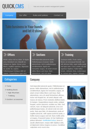
Responsiveness in action
The best way to show how this works is to show the simplest form of responsiveness: how a website's layout changes with different user screen sizes.
The screenshots below show the same website as seen by users of 3 different devices: a computer, a tablet and a cell phone. You can see how specific elements are presented differently depending on the available screen size.


Benefits from having a responsive website
Recently number and variety of internet access devices grows, with it grows the need for responsive websites. When using a tablet or a cell phone the users are then granted at least comparable pleasure from browsing a website to looking at it sitting at a full-sized computer screen.
It's one of the major benefits from making a responsive website. But it's not just about the website's size. Elements such as menus and buttons must also be considered. A mouse allows us to click on any link on the website we want with a fair amount of precision, even if it's very small. If a person tries to "click" using a finger on e.g. a tablet, there's no precision to speak of, so the buttons and links must be larger to minimize the risk of e.g. choosing the wrong menu item.
If the screen is very small (cell phones) it's good practice to limit unnecessary elements on a page. So we decide which contents we feel must be shown to the user, so he or she doesn't have to scroll and scroll to get what they need. In this case also the sequence of page elements becomes important. It's not like on a large screen, here the user can see only a small portion of a page, so the most important elements must be on top.
More and more people browse the internet through mobile devices, the solutions described above may be important to them and lack of those may make them leave your website and search for another one that offers better accessibility. It may lead to your restaurant losing a client just because on his way from work he tried to quickly check your menu or contact info on your website and he couldn't do it using his phone.
How to make a responsive website
Though making a responsive website (or adapting an existing one) may seem difficult or expensive, it's really not.
- If your website is based on Quick.Cms or Quick.Cart, you'll surely find one of our partners » would adapt your website (even if it's quite old).
- If you have the latest version of our scripts or you're just about to start creating your website, you can use one of the responsive skins for Quick.Cms » or Quick.Cart » we've prepared for you.
- Even if your website will have custom made graphics, you should ask your webmaster if he'll make it responsive.
- If you're preparing your website yourself, then use the "starter" - a skin named Responsive. It will much simplify your task, since it includes basic responsive behavior, you just need to adjust it to your design.
Summary
Responsive web design is an increasingly popular trend, we can assume it will soon become a standard. So it's wise to get interested in the issue now, adjust your website, if it's possible and remember about it when it's time for upgrading your website.